Excerpts from
Peter Turchin’s
History of the Near Future (Nov. 2019)
[Sorry for any typos. Still editing.]
Source: http://peterturchin.com/wp-content/uploads/2019/11/MPF2019.pdf
Indirect Source: http://peterturchin.com/cliodynamica/a-history-of-the-near-future-what-history-tells-us-about-our-age-of-discord/
Multimillionaires
Ratio of Multimillionaires to Total Population has been increasing. The increase is skewed toward wealthier people; i.e. the proportion of those with $10M in wealth has increased 5-fold whereas the proportion of those with $1M has increased 2-fold.
Real Wages
Real wages in the US have stagnated since 1970 (left chart). Note the accelerated rate of increase from 1920 to 1970! That was America’s golden period, and is further substantiated by the accelerated increase in GDP per capita during the same period and even longer.
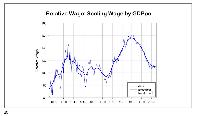
Where do waves come from? By dividing the data in the left chart (real wages) by GDP per capita (right chart). The result is what can be bought of as the proportion of economic output per person that is passed on to workers (in the form of wages), with the leftover representing the portion passed on as profits to owners of capital.
Relative Wage Cycle
The next chart shows the previously described ratio. We get cycles!
Double Spiral
There’s a second cycle (red color) that is called “elite overproduction”. A high value (as in 1900 or today) represents the situation where the ratio of Elite Population to Total Population is high. (For details, please see Turchin’s writings; here's his home page. Otherwise, please see this Tweet of mine from Feb. 2017. If you'd like to branch out to others authors, please see this other Tweet of mine, also from Feb. 2017.) The first slide (proportion of multimillionaires) captures the red line to some extent.
Possible Trajectories after Political Violence
The situation today (i.e. 2020s) is ripe for “political violence,” says Turchin. Possible trajectories can be visualized in the slide below.

Author is also on Twitter


No comments:
Post a Comment